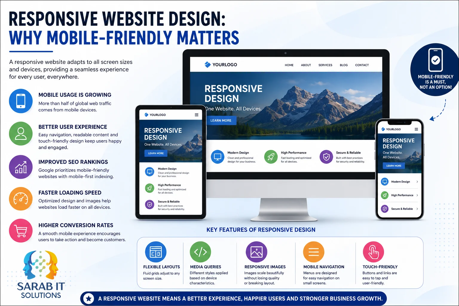
A responsive website is no longer an optional feature—it has become one of the foundations of modern web development. People browse the internet using smartphones, tablets, laptops, desktop computers, smart TVs, foldable devices, and many other screen sizes. Visitors expect websites to work smoothly regardless of the device they are using.
For businesses, responsive web design is about much more than adjusting layouts. A well-designed responsive website improves usability, supports search visibility, builds trust, increases engagement, and helps visitors complete important actions such as making enquiries, booking services, or purchasing products.
This guide explains what responsive website design is, why mobile-friendly websites matter in 2026, how responsive design benefits businesses, and the best practices for creating websites that perform well across all devices.
📱 What Is Responsive Website Design?
Responsive website design (RWD) is a web development approach that allows a website to automatically adapt its layout, images, typography, and interface according to the visitor's screen size and device.
Instead of building separate desktop and mobile websites, responsive design uses a single codebase that adjusts intelligently across different screen sizes.
Modern responsive websites typically use:
- Flexible grid layouts
- Fluid containers
- Responsive typography
- CSS Media Queries
- Flexible images
- Responsive videos
- Adaptive spacing
- Mobile-friendly navigation
For example:
- On a desktop, three service cards may appear side by side.
- On a tablet, those same cards may display in two columns.
- On a smartphone, they automatically stack into a single easy-to-read column.
The goal is to provide users with a consistent experience regardless of how they access the website.
🌍 Why Mobile-Friendly Websites Matter More Than Ever
People increasingly use mobile devices throughout the day for searching, shopping, comparing businesses, reading articles, booking services, and contacting companies.
Users often discover businesses while:
- Searching Google
- Opening social media links
- Scanning QR codes
- Clicking advertisements
- Reading emails
- Using voice search
- Looking for nearby businesses
If a website is difficult to use on a phone, visitors may leave before learning about the business.
A mobile-friendly website helps visitors:
- Read content comfortably
- Navigate easily
- Contact the business quickly
- Complete forms
- Browse products
- Make purchases
- Book appointments
Responsive design removes unnecessary barriers between visitors and the information they need.
🚀 Better User Experience Across Every Device
User experience (UX) plays a major role in website success.
Visitors expect websites to be:
- Easy to read
- Easy to navigate
- Fast
- Visually consistent
- Touch-friendly
- Accessible
Poor mobile experiences often include:
- Tiny text
- Horizontal scrolling
- Overlapping content
- Broken layouts
- Small buttons
- Difficult navigation
- Slow loading
These issues create frustration.
Responsive websites reduce these problems by automatically adjusting layouts and interface elements according to available screen space.
When users can easily consume content, they are more likely to continue exploring the website.
🔍 Responsive Design and Google Search
Google uses mobile-first indexing, which means Google primarily evaluates the mobile version of a website for indexing and understanding its content.
Responsive websites help create consistency between desktop and mobile experiences.
Search visibility depends on many factors, including:
- Helpful content
- Technical quality
- Page experience
- Internal linking
- Website performance
- Accessibility
- Crawlability
- Structured data
- Search intent
Responsive design alone does not guarantee higher rankings.
However, responsive websites often avoid many technical problems that make websites difficult for users and search engines.
⚡ Faster Websites Create Better Experiences
Website speed influences how visitors interact with a website.
Modern responsive websites should focus on:
- Optimized images
- Efficient CSS
- Optimized JavaScript
- Browser caching
- Lazy loading
- Modern image formats
- Reduced page weight
Visitors generally appreciate websites that display information quickly.
Performance improvements can also contribute to better engagement and lower abandonment.
📊 Core Web Vitals Matter
Modern websites should also consider Google's Core Web Vitals.
These include:
Largest Contentful Paint (LCP)
Measures how quickly the main content becomes visible.
Interaction to Next Paint (INP)
Measures how responsive a page feels after user interactions.
Cumulative Layout Shift (CLS)
Measures whether page elements unexpectedly move while loading.
Responsive design supports these metrics when combined with good development practices.
🎯 Better Conversion Opportunities
Responsive websites make it easier for visitors to take action.
Examples include:
- Contact forms
- Quote requests
- Online booking
- Phone calls
- WhatsApp chats
- Newsletter signup
- Ecommerce checkout
Visitors should never struggle to complete these actions simply because they are using a mobile phone.
🛍 Responsive Ecommerce Experiences
Online shopping increasingly happens on mobile devices.
Responsive ecommerce websites help customers:
- Browse products
- Filter categories
- View images
- Read descriptions
- Add products to cart
- Complete secure checkout
A consistent experience across desktop and mobile reduces friction throughout the buying journey.
🧭 Navigation Should Work on Every Screen
Navigation is one of the most important parts of responsive design.
Good mobile navigation should be:
- Easy to find
- Easy to understand
- Easy to tap
- Consistent
Popular navigation approaches include:
- Hamburger menus
- Sticky headers
- Expandable menus
- Mega menus for desktop
- Bottom navigation (where appropriate)
The goal is helping users reach important pages with minimal effort.
🖐 Touch-Friendly Design
Unlike desktop users, mobile users interact with their fingers.
Responsive websites should provide:
- Large buttons
- Comfortable spacing
- Easy form inputs
- Tap-friendly menus
- Swipe-friendly galleries
Touch interactions should feel natural rather than frustrating.
🖼 Responsive Images
Images should automatically adjust to different screen sizes.
Modern responsive websites often use:
- Flexible image sizing
- Responsive image loading
- WebP or AVIF images
- Lazy loading
- Appropriate compression
These techniques improve performance while maintaining visual quality.
♿ Accessibility Benefits
Responsive websites also support accessibility.
Good responsive design considers:
- Readable font sizes
- Proper spacing
- Color contrast
- Keyboard navigation
- Screen reader compatibility
- Clear headings
- Accessible forms
Accessibility improves usability for a wider range of users.
🏢 Industries That Benefit From Responsive Websites
Almost every industry benefits from responsive web design, including:
- Business websites
- Ecommerce stores
- Healthcare providers
- Educational institutions
- Real estate agencies
- Restaurants
- Travel companies
- Software companies
- Manufacturers
- Service providers
Regardless of industry, visitors expect websites to function well on every device.
📱 Responsive Design vs Separate Mobile Websites
Years ago, many businesses maintained separate desktop and mobile websites.
Today, responsive design generally provides several advantages:
- One website to maintain
- Consistent branding
- Easier updates
- Simpler analytics
- Reduced duplication
- Better long-term scalability
A single responsive website is usually more efficient than maintaining multiple versions of the same content.
🔮 Future of Responsive Web Design
Responsive design continues to evolve alongside technology.
Modern websites increasingly consider:
- Foldable phones
- High-resolution displays
- Progressive Web Apps (PWAs)
- Voice interfaces
- Wearable devices
- Smart TVs
- AI-assisted browsing experiences
Future-ready websites focus on flexibility rather than fixed layouts.
✅ Best Practices for Responsive Website Design
A modern responsive website should:
- Follow a mobile-first development approach
- Use flexible layouts
- Optimize images
- Improve page speed
- Keep navigation simple
- Maintain readable typography
- Support accessibility
- Test across multiple devices
- Monitor Core Web Vitals
- Use secure HTTPS
- Regularly review performance
Responsive design is not simply about making a website smaller—it is about creating an experience that works naturally across every screen.
⚠️ Common Mistakes to Avoid
Many websites still experience problems such as:
- Tiny text
- Buttons that are difficult to tap
- Images larger than the screen
- Horizontal scrolling
- Slow loading
- Poor spacing
- Broken layouts
- Unoptimized images
- Overly complex navigation
- Popups that block content on mobile devices
Avoiding these issues significantly improves usability.
🏁 Conclusion
Responsive website design has become an essential part of modern web development. People expect websites to work seamlessly across smartphones, tablets, laptops, desktops, and emerging devices.
A responsive website helps businesses provide a better user experience, improve accessibility, support search visibility, reduce maintenance complexity, and create stronger opportunities for enquiries, sales, and long-term growth.
Rather than building separate websites for different devices, responsive design creates one adaptable experience that serves users wherever they browse.
As technology continues to evolve, responsive design remains one of the most important investments a business can make in its online presence.
💼 Need a Responsive Business Website?
At Sarab IT Solutions, we build fast, modern, responsive, and SEO-friendly websites that work beautifully across all devices. Whether you need a business website, ecommerce store, custom web application, or website redesign, our team can help create a responsive solution tailored to your business goals.
Contact Sarab IT Solutions today to build a responsive website that delivers a better experience for every visitor.