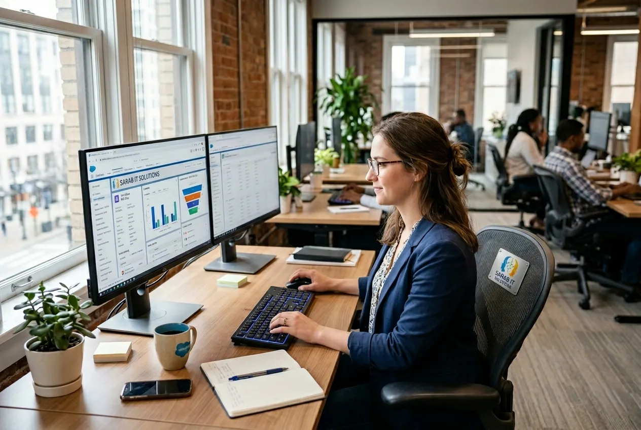
Modern responsive websites designed to deliver seamless user experiences across mobile, tablet, and desktop devices.
At Sarab IT Solutions, we create responsive websites that automatically adapt to different screen sizes and devices for the best user experience.
Our responsive web design solutions improve website usability, mobile performance, SEO rankings, and customer engagement across all platforms.
Modern design solutions optimized for every device and user experience.
Websites designed to work perfectly on smartphones and tablets.
Smooth and consistent user experience across desktop devices.
Optimized layouts and assets for faster website loading speed.
Responsive structures that improve Google search rankings.
Clean, attractive, and user-focused website interfaces.
Websites compatible with Chrome, Firefox, Safari, and Edge browsers.
Improve user experience and business performance with responsive websites.
Better mobile experience
Optimized website performance
Higher Google rankings
Improve customer interaction
Responsive web design allows websites to adapt automatically to different screen sizes and devices.
It improves user experience, SEO rankings, and mobile usability for visitors.
Yes, all responsive websites are optimized for smartphones, tablets, and desktops.
Yes, we can convert outdated websites into fully responsive modern websites.
Letβs build a fast and mobile-friendly website for your business.